On a whim, I posted a screenshot of my app’s UI on social media and got a lot of good feedback. I’ve wanted to get better at UI/UX for a while, and now seems as good a time as any.
I figured I’d try to learn from the suggestions in public, too. I’ve put the before and after screenshots in the same post so you can see if I took anyone’s advice.
I’ve also linked to a few people whose work I like, in case you’re looking for more of this stuff in your feed.
Table of contents
Open Table of contents
Context and goal
I’ve been building software for a while, and I’ve always admired people who can make apps look great. I can do “okay”, but it’s good to have goals.
They say taste is all that’s left for us humans in the age of AI. I feel confident in my backend and software architecture taste, but not really in my UI/UX taste. UX matters much more to me than UI, but I still want to build software that looks great and feels great to use.
I’ve always found this hard to learn, so I posted a screenshot of my to-do app. And, to my surprise, people whose design work I really like took the time to tell me what they’d change. Thanks!
There’s no better way to learn on the internet than to confidently throw out what you’ve done and have people correct you. Or so they say.
The app and its target user
I call it “t’inquiète pas”. It’s my personal, homegrown to-do system, built after I got too annoyed with Atlassian fucking up Trello, which I’d used for a long time. I just want a simple system where I can build boards with different lists and cards, and organize my life and individual projects that way.
The target user is me. And my AI agents, I guess, so it has a nice MCP server/skill/fine-grained permissions built in. But I digress. I host it for my own convenience, but you can have a look. I randomly push changes I like, I have no backups, and I don’t put much effort into protecting it. I’m sharing it for context, not putting it out as a product, so please don’t use it.
It’s a local-first app using Automerge, by the folks at Ink & Switch. I am a big fan of the idea of local-first and this seemed like a great time to try.
Current app screenshots
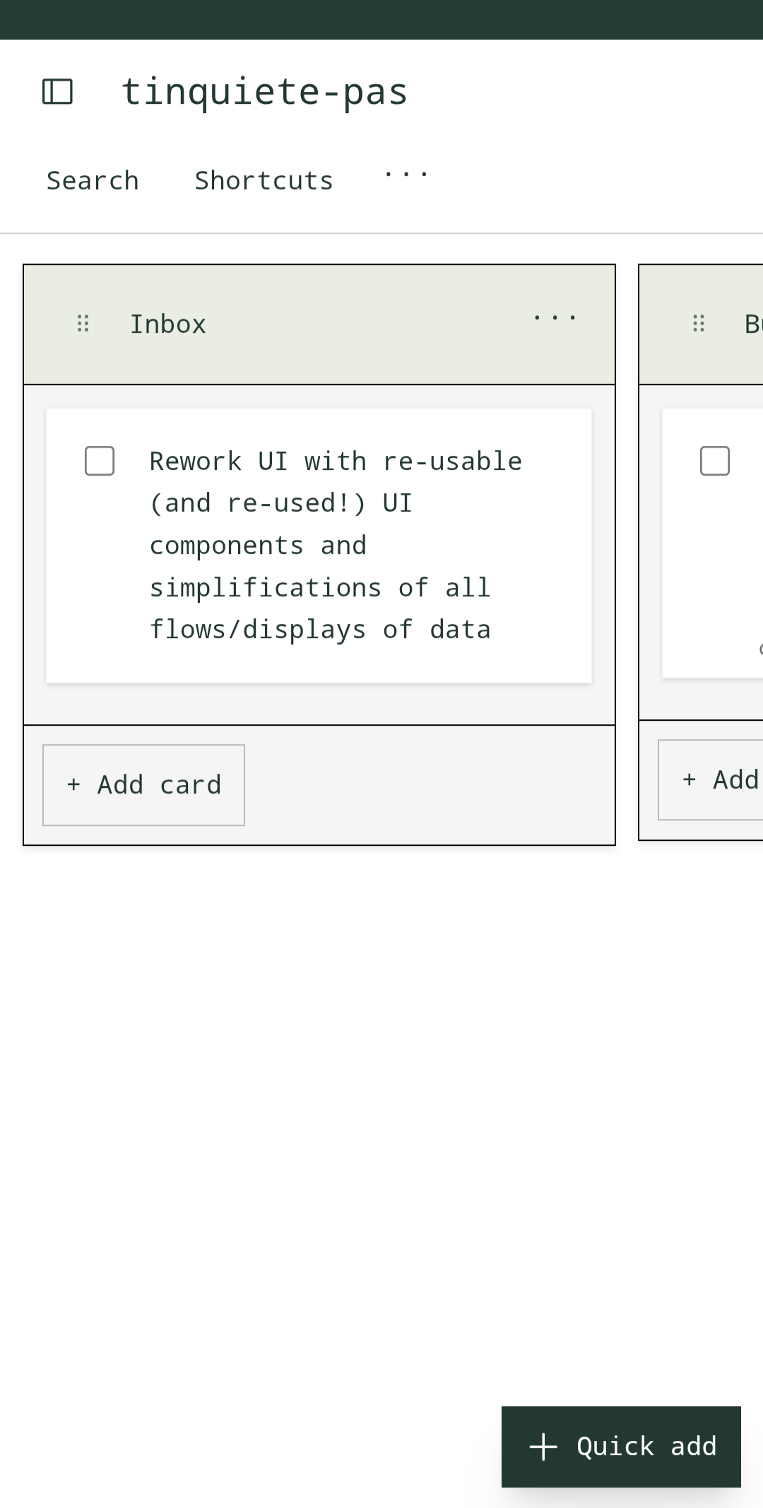
This was my starting point. I’m one of those people who uses light mode on purpose. I wanted the app to look clean without drawing too much attention to itself, so I went with pastels. No one ever got fired for choosing pastels.
The original post
After tinkering with the app a bit, I put a screenshot on Bluesky and asked:
Feedback
1. Adam Wiggins
Adam is one of the people behind Ink & Switch. Have a look at his homepage, and definitely give him a follow.
2. Marcel
Marcel is a big inspiration for me to even think about building good UIs and adding delight to my apps. He draws daily comics whose style I really enjoy, and I love reading them. His work on iOS apps shows how much time he puts into thinking about high-quality products. Definitely follow him and read his blog if you’re interested in this.
3. Konstantin
Konstantin is another person worth following if you’re interested in building new products and being a thoughtful consumer of technology. You should be reading his blog.
4. Dave Sanders
5. Yann 不停 Heurtaux🔻
6. sarathy.ux
7. twaenny
8. not.axel
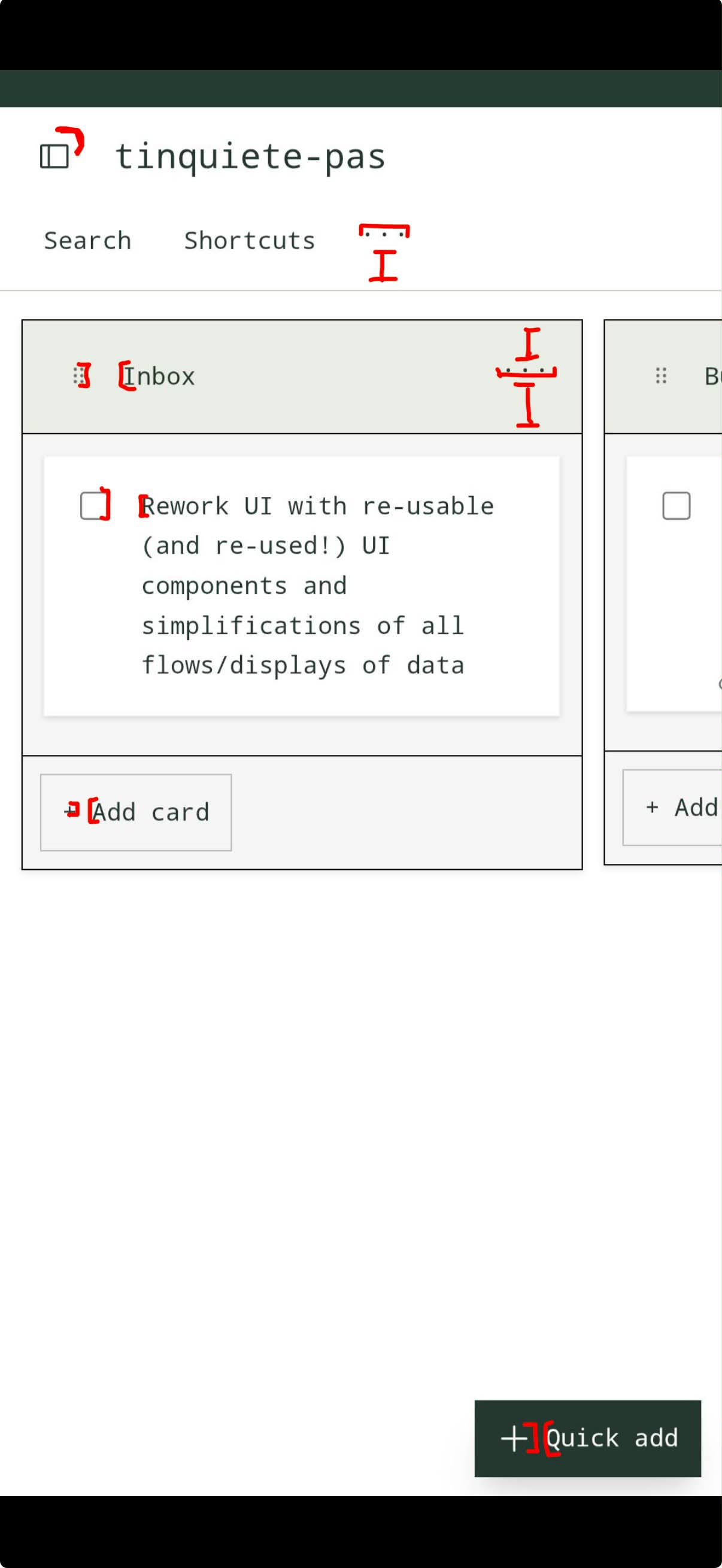
Monospace without consistent units looks out of place, the equal width letters with un-equal width UI items mismatches. If youre commited to monospace you have to align things and use units, like char width.
Serifs are more flexible and also contextualize the rounded elements. You’d still likely want to make things more consistent, but the font wouldn’t contrast with the UI.
 View full image
9. sixteentwelphi
10. takcastel
Learnings
Here’s what I took from the replies. The next step was seeing if I could actually do any of it.
Ensure scannability
Feedback: 1. Adam Wiggins, 2. Marcel, 3. Konstantin, 4. Dave Sanders, 9. sixteentwelphi.
Similar type sizes and weights, monospace text, and low contrast make it hard to scan the UI and quickly understand its structure. The app header and list headings are too small and subtle to establish a clear hierarchy. The Quick add button breaks the visual hierarchy.
I think I should use size, weight, and contrast to make the hierarchy clearer. It should also be obvious which items are buttons or links and what they do.
Be deliberate in your font choices
Feedback: 1. Adam Wiggins, 3. Konstantin, 6. sarathy.ux, 8. not.axel.
The monospace typeface contributes to the scannability problems. It also seems divisive: people either really like it or dislike it. Some of the feedback suggests that the font and icon choices make this UI look AI-generated.
After reading up on this a bit more to have a clearer picture, I understand that in monospace fonts, every character takes up the same width. Serif fonts have small strokes at the ends of letters. Sans-serif fonts don’t. Either kind can have characters with equal or varying widths.
In my case, my understanding is that the monospace font contributes to the UI elements looking off when they’re different sizes. It encourages me (or basically forces me) to align the UI elements along a grid based on the character widths too.
If I stick with monospace, I need to simplify the surrounding elements and align them to that grid. Moving away from monospace fonts would give me more flexibility, but I would still need to keep the UI consistent.
The UI is technical
Feedback: 2. Marcel, 3. Konstantin, 5. Yann 不停 Heurtaux🔻.
Konstantin describes the simplicity positively, and Yann finds the style acceptable in a productivity setup. I read both as pointing in the same direction: the UI and UX feel like spreadsheet software. Simple, boring, technical, and meant to get out of the way.
Marcel found it hard and technical, with strokes around boxes and boxes inside boxes. Fair. When I don’t know how to separate two things, I tend to draw a box. And I like square corners, which probably doesn’t help.
A to-do app can get away with being a bit boring. Still, I could lose a few boxes and see if the board gets easier to scan.
Unclear UX elements
Feedback: 2. Marcel, 3. Konstantin, 6. sarathy.ux, 7. twaenny, and partly 8. not.axel.
For a lot of the UI elements, it’s unclear whether they’re buttons or links, whether they open overlays or take you to another page, or whether you can interact with them at all. That’s definitely something to improve. The elements also don’t align well with the text, which I already covered in the font learning.
Marcel called the icons “floaty”, which seems fair, but I also really struggle with having a clear idea how to fix. I think that is one of my main problems, I don’t really have a clear path in my head how to get from feeling something is off to fixing it for UI issues.
Changes in this iteration
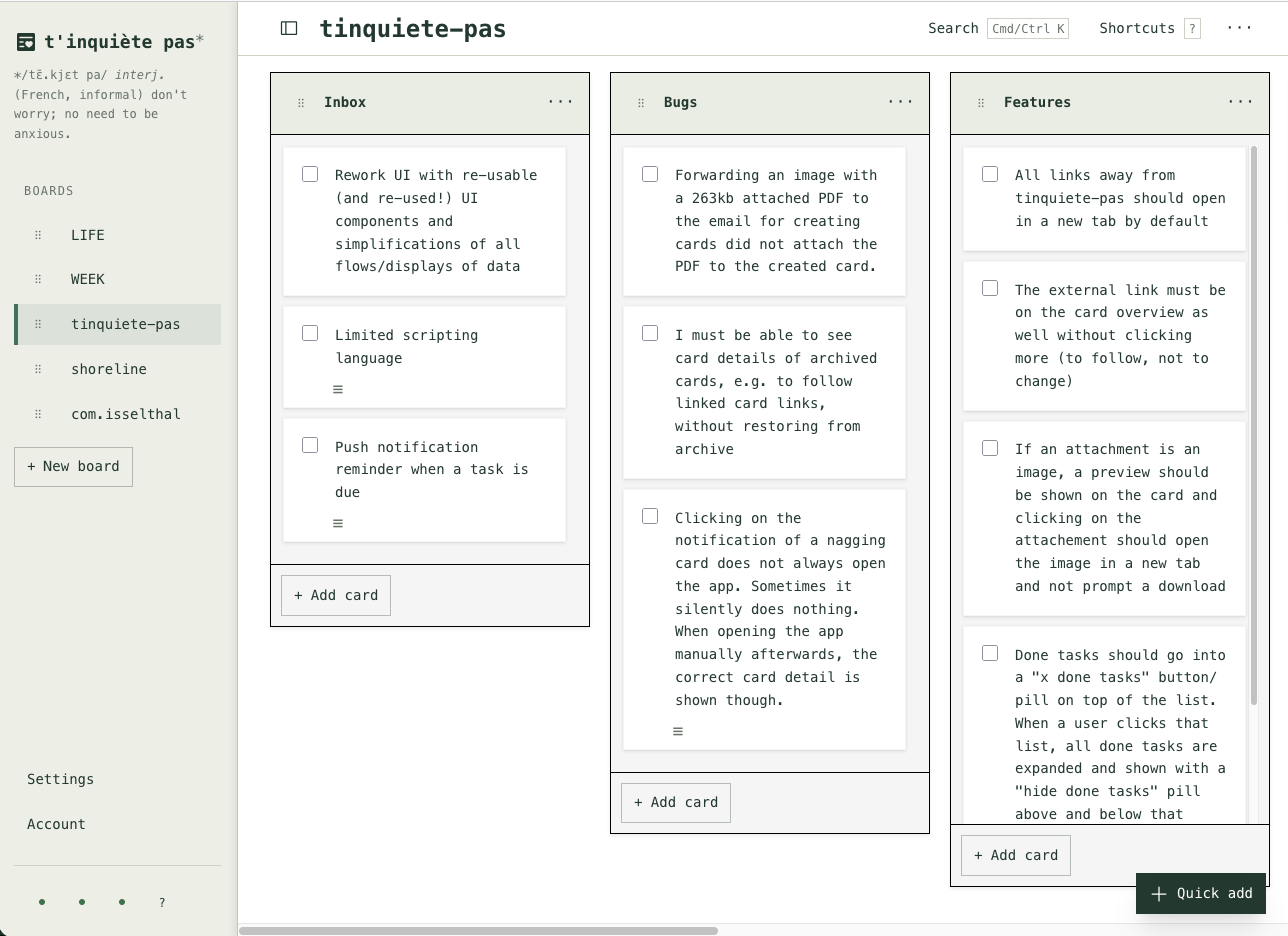
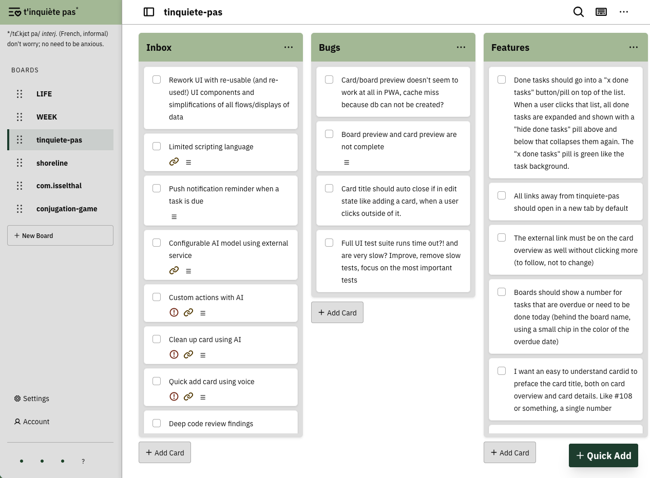
- Switched to IBM Plex Sans and cut down the number of text sizes. Board names are bold so I can scan the sidebar, and list titles are larger so I can scan the board.
- Reduced the colors to a few tokens based on what they’re used for. I darkened list headers and backgrounds for more contrast.
- Used a few shared spacing values and lined up icons and text.
- Rounded the corners on cards and lists, with a smaller radius for buttons.
- Gave buttons a consistent style and an enforced icon. Some buttons are now icon-only.
- Made icons larger, thickened their strokes, and matched their size to the text.
Before
 View full image
After
 View full image
Before
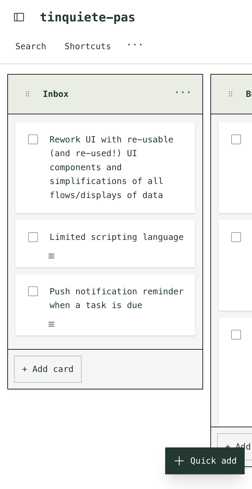 View full image
After
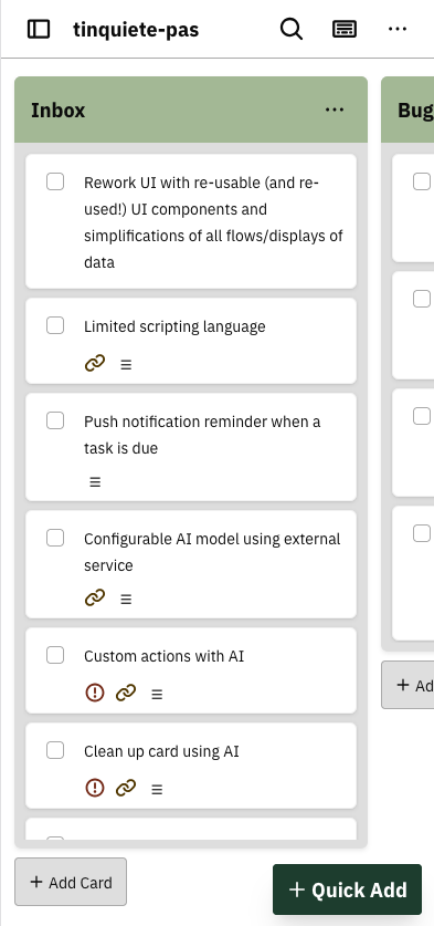 View full image
Before
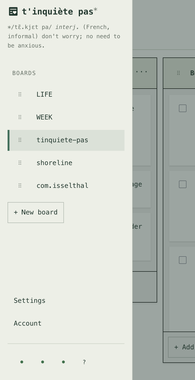 View full image
After
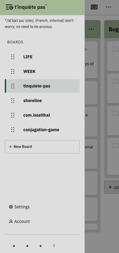 View full image
What’s next
Quick add looks fine for me on mobile because it’s closer to the boards, but I’m not happy with it on desktop because it’s so far out of the way.
I’d also like to work out a “real” color palette. Right now my accent is green, which I’ve cleverly paired with a slightly different green on the surfaces. What can I say, I like green. I’ve heard opposite colors can work well, so orange comes to mind. But what do I actually make orange? The primary buttons, or something else?
I don’t really know how to think about color palettes yet. If you’ve read something that helped you figure out what jobs different colors should do in an app, I’d love a reading suggestion.